FIRST LOOK: This is a Full Walk-Through of the All-New Sling TV App (Is it Good?)

In February, Sling TV Group President, Michael Schwimmer, in an interview with The Streamable, said the key to reinvigorating Sling’s growth is focusing on the basics. One of those he highlighted was the “user experience of the app” and “making it easy to find content and easy to navigate.”
And that begins today.
We got an early look of what will ultimately be a redesigned Sling TV app across all major platforms, which first comes to select Fire TV users in beta starting today. The redesign focuses on simpler navigation, better personalization, an improved grid guide, and easier access to your content.
It will roll-out to all Fire TV users over the coming weeks, then to Roku devices later this summer, and others like Apple TV and Android TV to follow.
This is our full walk-through of the all-new Sling TV App. For a limited time, you can get your first month of Sling TV for just $10.
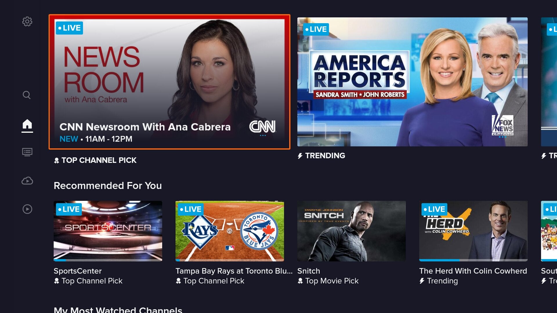
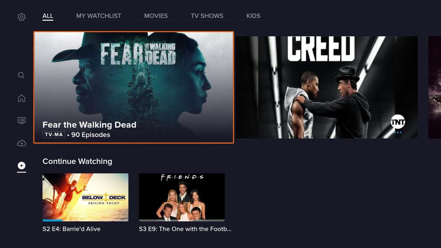
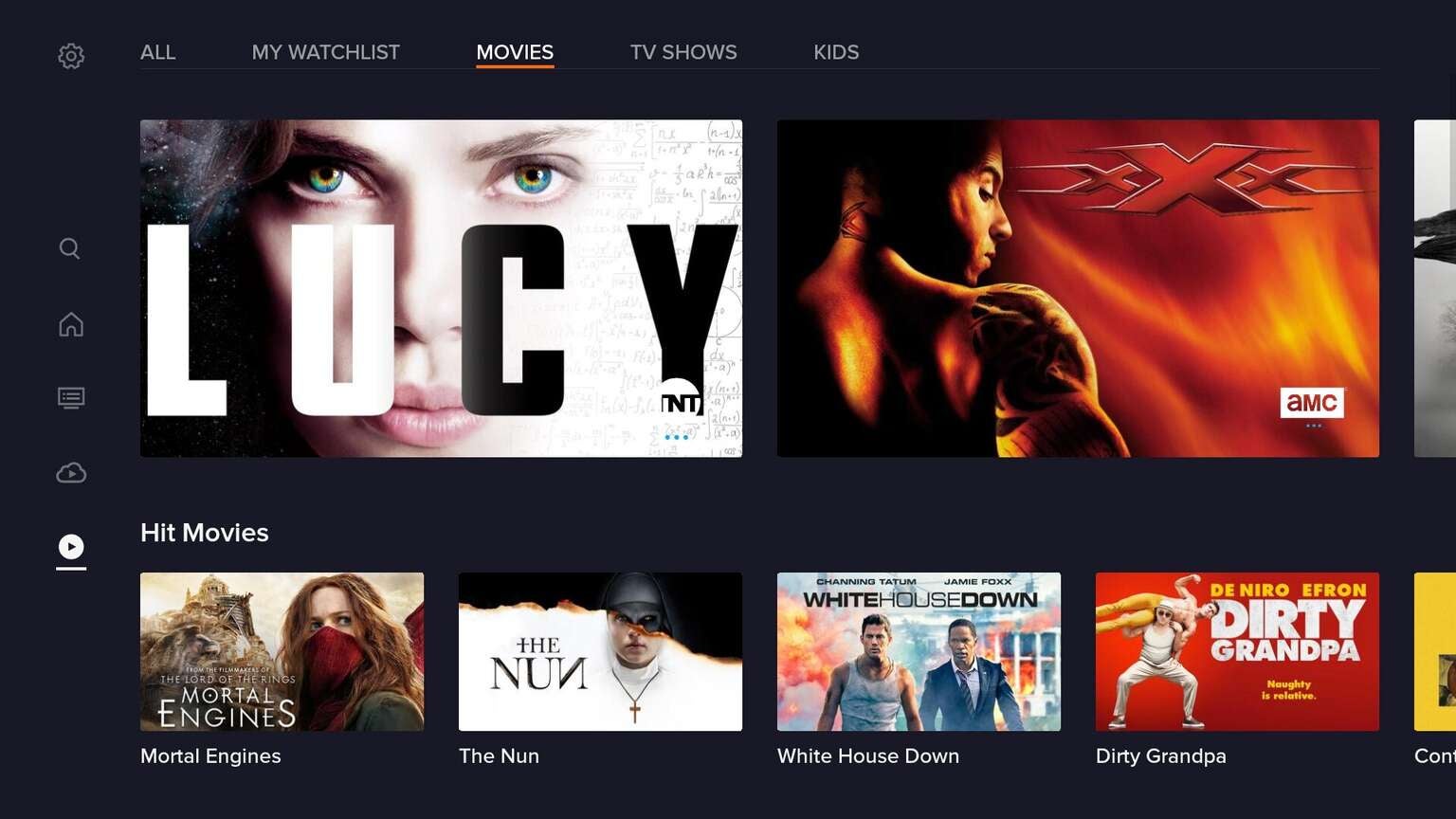
Home Screen
When you first open the new Sling TV app, you’ll be taken to “Home”, which has been renamed from “My TV”. Immediately, you’ll notice that everything just pops just a bit more. The new app has much more vibrant images representing shows, with top and trending channels now appearing prominently at the top.
Old App

New App

Another change is now on top of show images, they have badges for content that is currently live or being recorded, which no longer clash with the title of the shows. On the old interface, at least on Fire TV, every show or movie cell was all the same size. In the new app, some are larger, some are wider, all to call out prominence depending on what you’re looking at.
There is more spacing between the poster cells of shows and movies, and there is a more rich orange color that appears around the currently selected cell. They still show viewers how far they are into a live show, but the indicator is now blue, instead of orange.
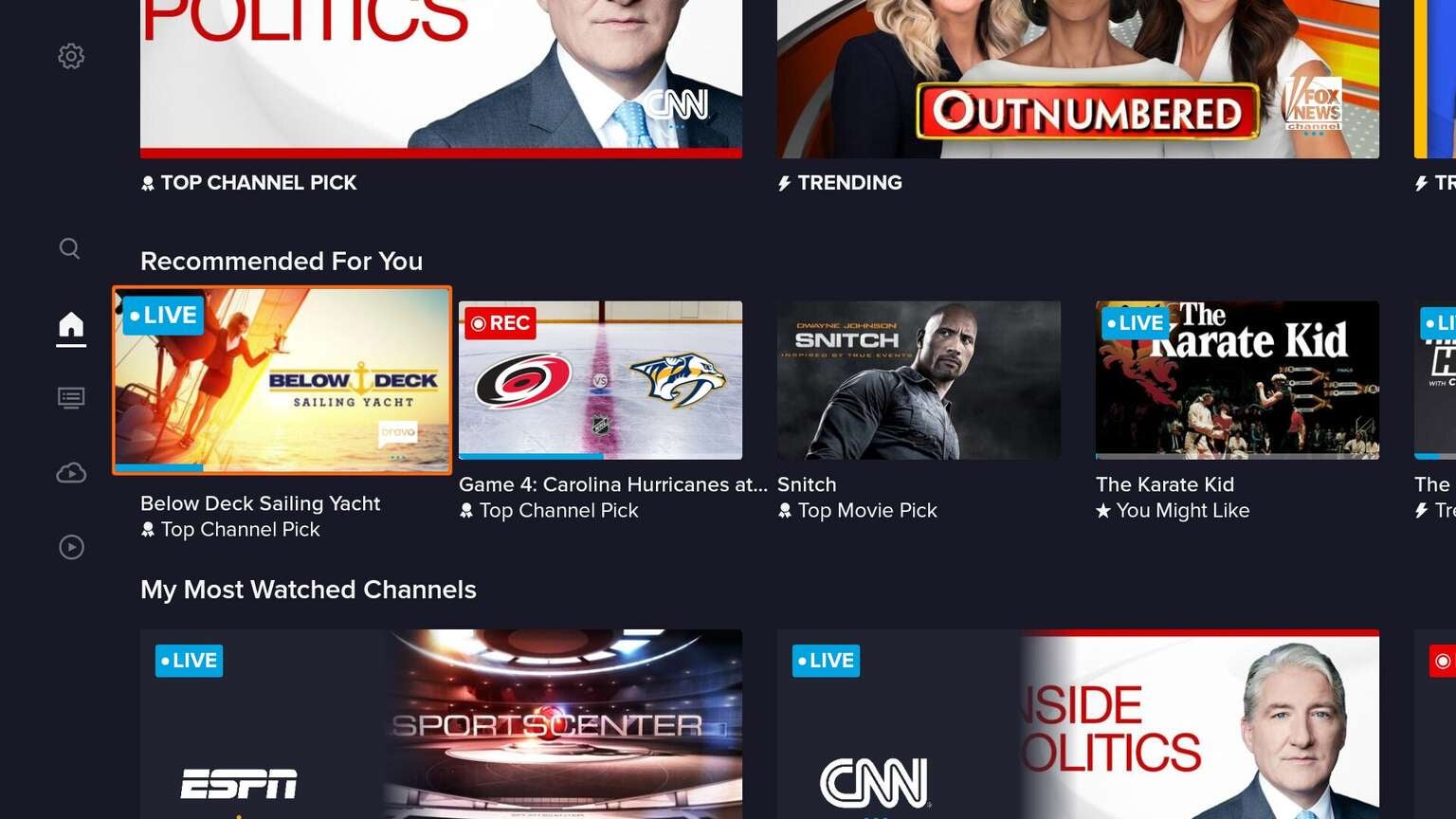
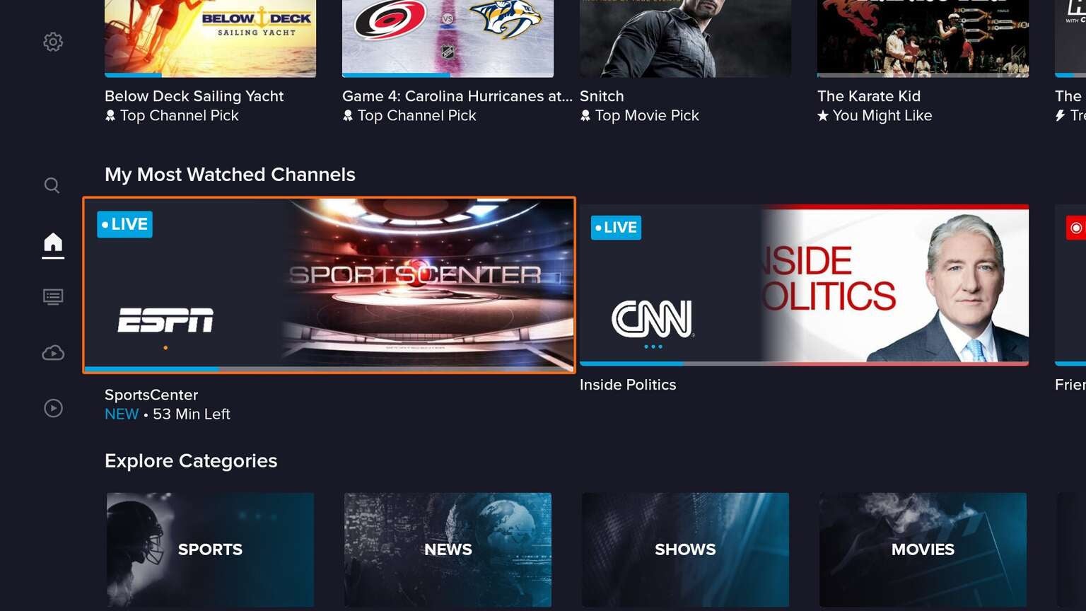
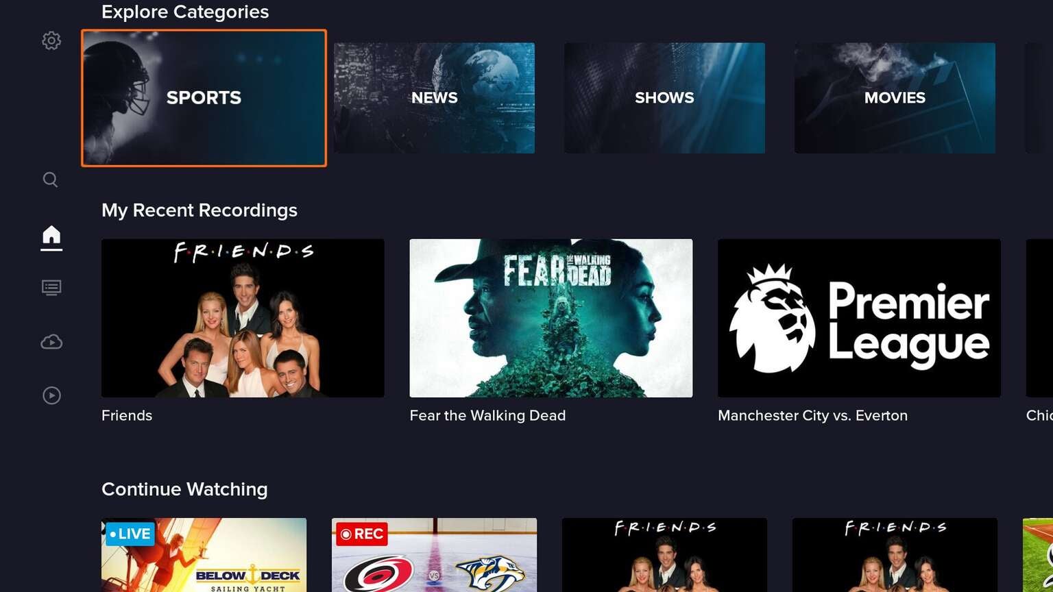
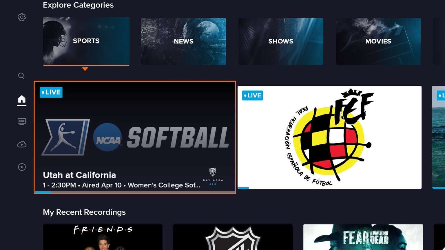
If you keep scrolling, they have sections for recommendations and your most-watched channels. There are also sections to quickly access categories like sports, news, shows, and movies, which then display in-line recommendations of live content.
Navigation
My favorite change to the overall interface is the more intuitive way to navigate around the app. In the old Sling TV app, there were tabs across the top with access to “Guide”, “Sports”, “On-Demand”, and “Search.” In the new app, however, navigation shifts to the left side of the screen, with the addition of a “DVR” button in place of “Sports.”

This subtle addition of the “DVR” button is a game-changer. Previously, you had to scroll to a “My DVR” section on the home screen to access your recordings, now it is just one click away.
The navigation in this beta release definitely had a few minor quirks, where behavior is slightly different depending on where you are in the app. In most cases, if you tap the back button, it will take you to the top of the page (first content cell), and then a second time will activate the navigation sidebar.

Whenever you activate the sidebar, it will have the “Guide” row selected, which makes it accessible on your next tap. On one hand, it’s nice to be one tap away from the “Guide”, but on the other, it’s strange that it shows two different sections as “highlighted” on the sidebar.
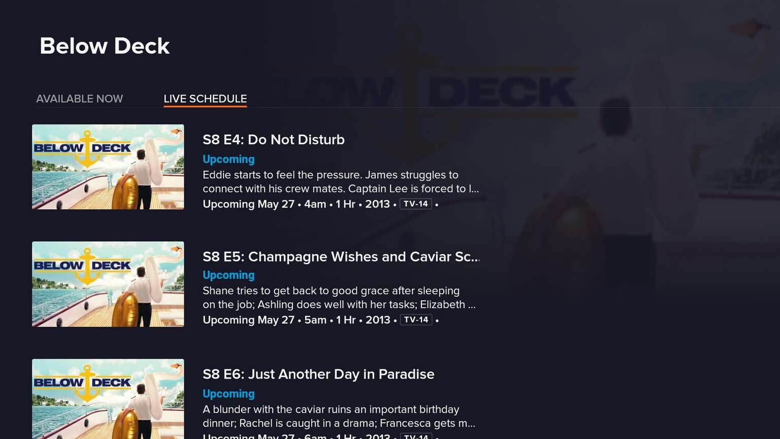
Grid Guide
When we asked Sling TV users in February for their most requested feature, they told us that they wanted a new “Grid Guide.” Some of the elements they brought in from their improved guide on Apple TV from last year, like the ability to quickly mark a channel as a favorite.
Old App

New App

Just like the entire interface as a whole, the new “Grid Guide” is also much more readable from a distance. The new “Grid Guide” adds in a few additional features, like the ability to see the description of what’s airing on a channel while scrolling and quicker access to categories like “A-Z”, “Favorites”, “Recents”, and “Sports” along the top. Previously, there was a “Filter” pop-up to access some of these categories.
Old App

New App

Fortunately, Sling TV will remember which one you had selected, so if you want to default to “Favorites” or “Recents”, it will be pre-selected when you return to the guide.
They also got rid of the old “Channel” Guide format, which existed in the original Sling App, even before it ever had a “Grid Guide.” It was a legacy style that really no longer useful except to browse on-demand content from an individual channel.
Old App

Also, on the far left, it will show you the current time, which we’ve seen requested across many Live TV Streaming Services. You can also now tap the “Menu” button (☰) on a selected row to bring up recording options.
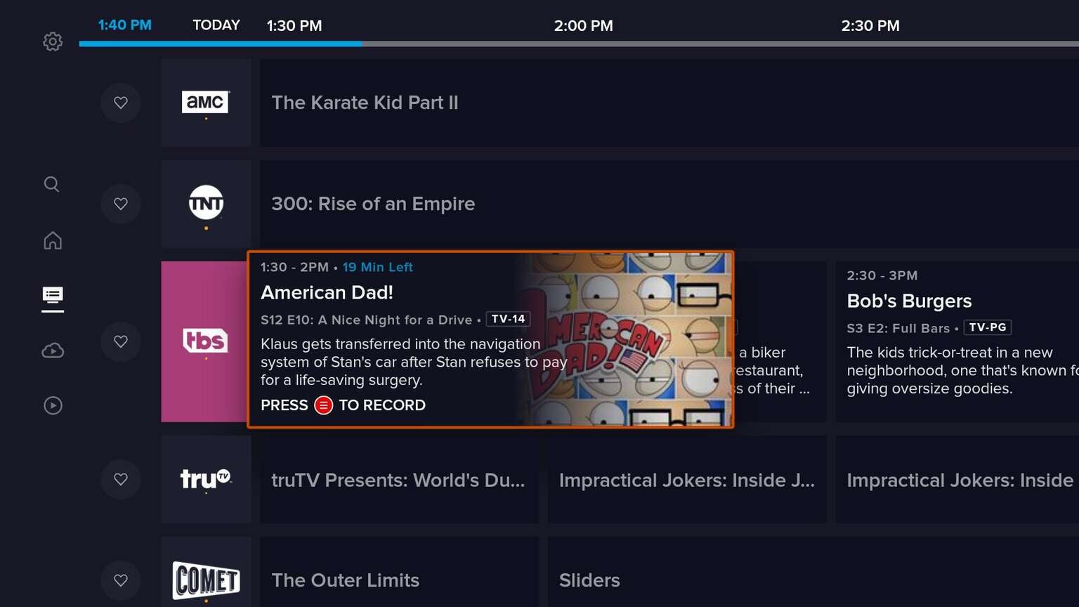
One area that could be improved on the new guide is the quick scroll. When scrolling up and down, as well as left and right, at full speed, it is definitely not as fast as the previous grid guide. It also only shows the channel name, not what’s currently airing when you are scrolling at full speed.

DVR
Outside of the new design itself, probably my favorite feature is the dedicated section for your DVR. To access your DVR in the old app, it took six or more taps, where now it’s just four taps from almost anywhere in the interface.
Old App

New App

Recordings still show up in a grid, but the entire way to manage recordings has been simplified. There are now three sections across the top, “Recordings”, “Scheduled”, and “Trash.”
You can delete an individual recording or an entire collection with a single tap of the “Menu” button (☰), instead of having to go to a separate “Manage Recordings” section. Beware though, it doesn’t ask you to confirm before deleting. But if you do, now when you delete a recording, you have 48 hours to recover it from the “Trash” section.

One feature that has been removed, is by default, all recordings are now ordered by how recently they were recorded. There is no longer a way to sort in alphabetical order or just to see unwatched shows.
Old App

New App

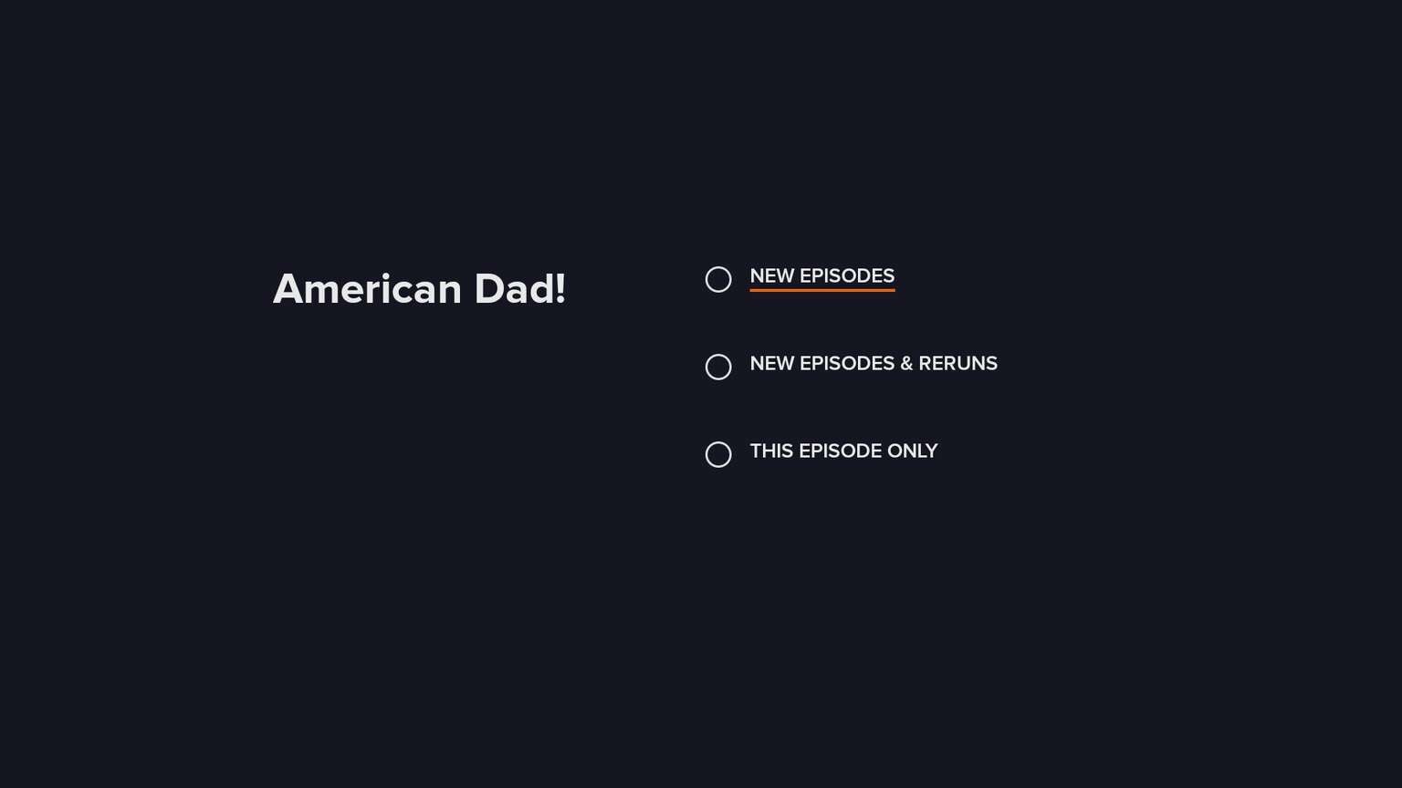
One area that has gotten a major upgrade is the “Scheduled Shows” section, which now actually tells you when something will be recorded and whether it is just recording new episodes or all episodes.
When you actually playback a recorded show, you can still either 30-second skip by tapping the “Right” arrow or fast-forward. Both activate thumbnail previews so you can see exactly where you are in the episode.
Search, On-Demand, and Show Details
This is one area where not much seems to have changed from the previous app. But, there is a really strange change, that when you go to the “Search” page, it now hides the keyboard by default.
Sling told us this came out of research that the majority of searches were either conducted by selecting a previous search term or a recommended search result. They said that they plan to closely monitor this as the new experience is released.
Old App

New App

When you actually search, the results are pretty similar. The old interface let you filter based on shows and movies, while the new one doesn’t. They both display results as you are typing, so you can get to what you want pretty quickly.
Old App

New App

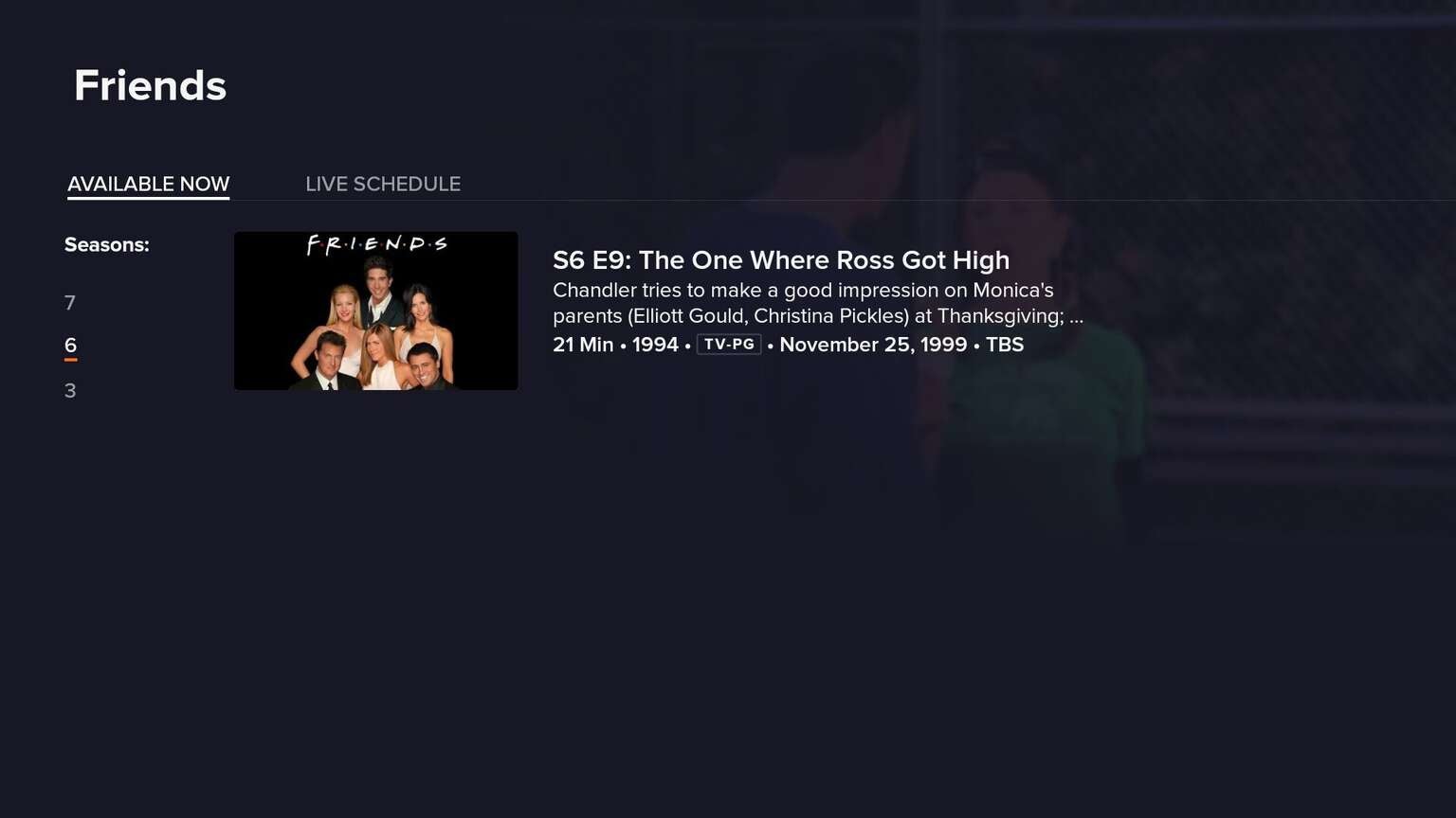
When you tap on a show, it now more clearly displays all the episodes. It also calls out the latest episodes at the very top, which is a nice new enhancement. If you don’t want to record a show, you can add it to your “Watch List”, which you will be able to access from the “On-Demand” section later.
Old App

New App

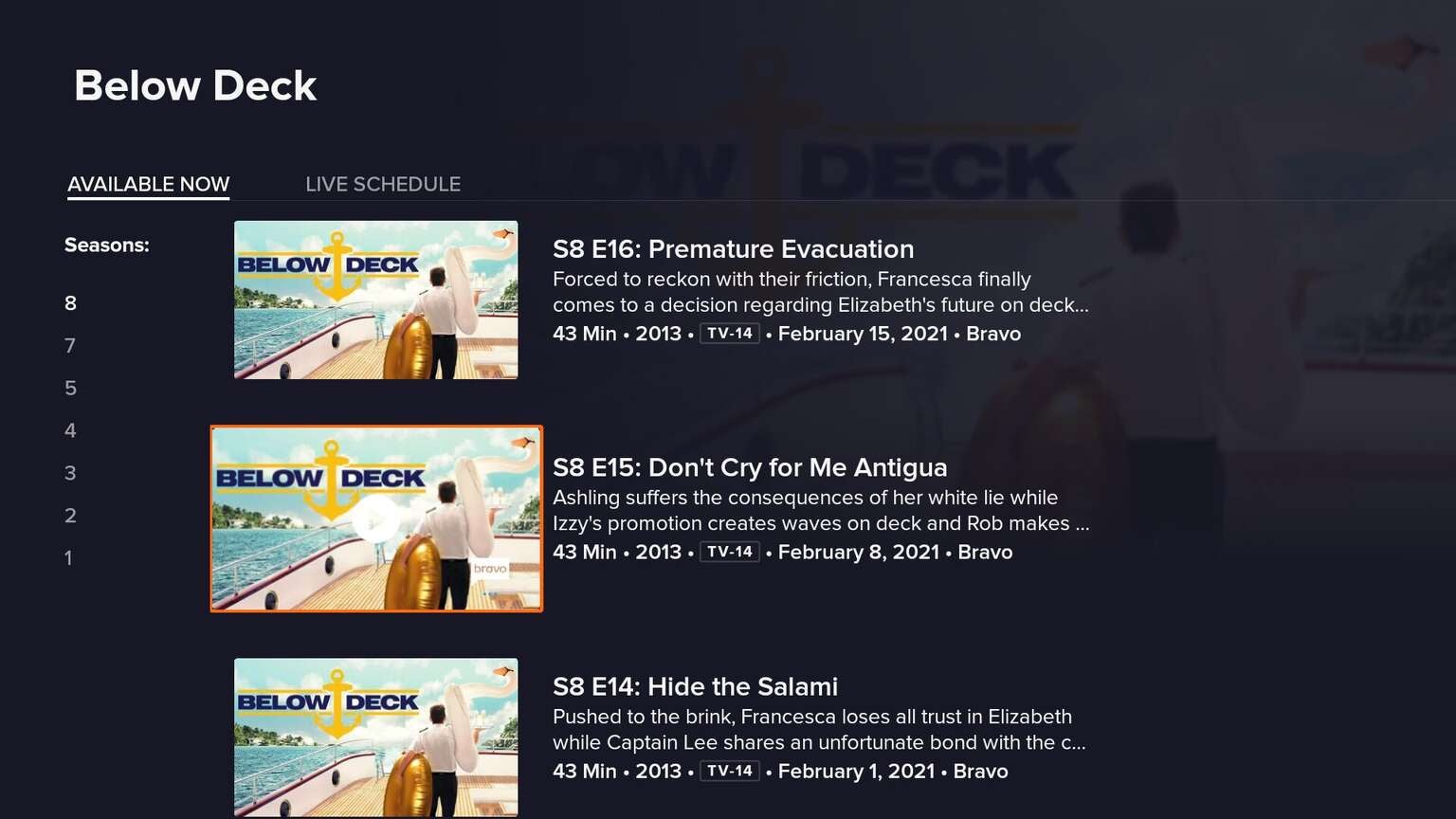
There was some strange behavior with integrating my DVRed content on the show detail page. For instance, even though there were 18 episodes of “Friends” on my DVR, only a few (presumably, the ones available on-demand) were available while searching for the show. Also, it wouldn’t show results until I actually selected a season of the show.
Hopefully, when the full version rolls out, it will display all available on-demand and recorded content, and let you choose between the two.
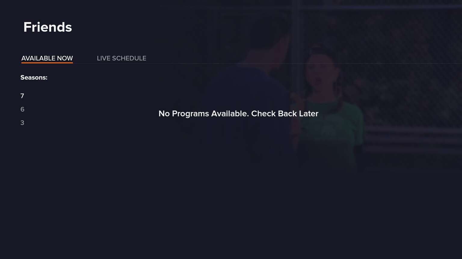
The “On-Demand” section is very similar to that on the old interface, just with the new styling. While each section — “TV Show”, “Movies”, etc. — has categorized content, it would be nice if you could filter by a category, like “Comedy”, or by network, like “Bravo.”
Playback Controls
The one final area where Sling TV improved their app was when actually watching a show. The old Fire TV app had way too many keyboard actions where it wasn’t clear what would happen depending on what button you pressed on your remote.
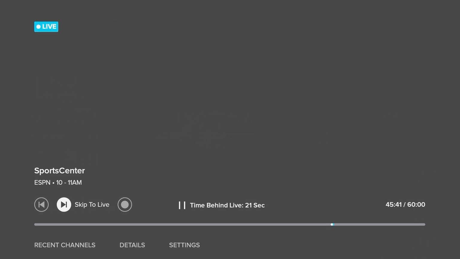
Now, it is dead simple. If you tap “Play/Pause” or the “Select” button, it will bring up an improved overlay. Since the new app supports “Pause on Live” (for up to 60 minutes on most channels), it will tell you how far behind the live broadcast you are. You can skip ahead or fast-forward with thumbnail previews, just like on recorded content.
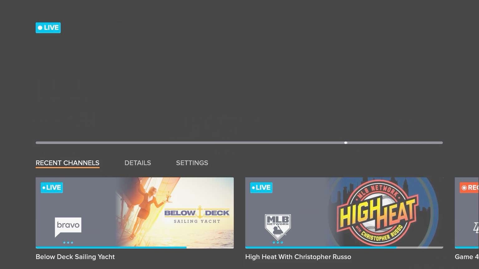
When paused, if you tap “Up”, you can “Play From Start” (when you first tuned to the channel), “Skip to Live”, or “Record.” Also when paused, you can tap “Down”, to access “Recent Channels” which means you can go back to the last channel with three taps.
It would be nice if they added some simple remote shortcuts like tap and hold “Select” to go to your last channel or tap “Menu” (☰) to record, like other places in the interface.
It would also be nice if there was a way to navigate the interface without disrupting playback. When you leave a live channel to go back to the “Grid Guide” or “Home”, it completely stops playback. Sling TV told us that they plan to introduce a more robust “Browse while Watch” feature.
Video Walk-Through
The Verdict?
As Sling TV’s president told us, you have to focus on the basics. With the new app, it’s clear that Sling TV is back to focusing on the “little things” which make a Live TV Streaming Service great. Overall, the new design is much more visually appealing, easier to navigate, and just makes sense.
Over the past year, Sling TV has removed DVR restrictions, added Pause on Live and Sling Watch Party, and integrated local channels via Locast on select devices.
While there are some minor quirks and feature enhancements that could be added, if you haven’t tried Sling TV in a while, it will feel like a totally different experience for you when you get your hands on this.
In February, Dish Chairman Charlie Ergen admitted that Sling “maybe got a little complacent” and “stumbled a little bit with the quality of the user experience” and relied too much on the value aspect of the service. With the new app, it’s clear that Sling TV knows that you have to bring design and quality, just as much as a low price.
Select Sling TV users on Fire TV will begin to receive the new app starting today, with it rolling out widely over the next few weeks. Next up is Roku coming this summer, followed by other platforms like Apple TV and Android TV.
For a limited time, you can get your first month of Sling TV for just $10.