What are audiences saying about Netflix’s new user interface?
What are audiences saying about Netflix’s new user interface?
Viewers don’t seem too keen on the experience thus far, but Netflix says there could be more fans of the new layout than it seems.

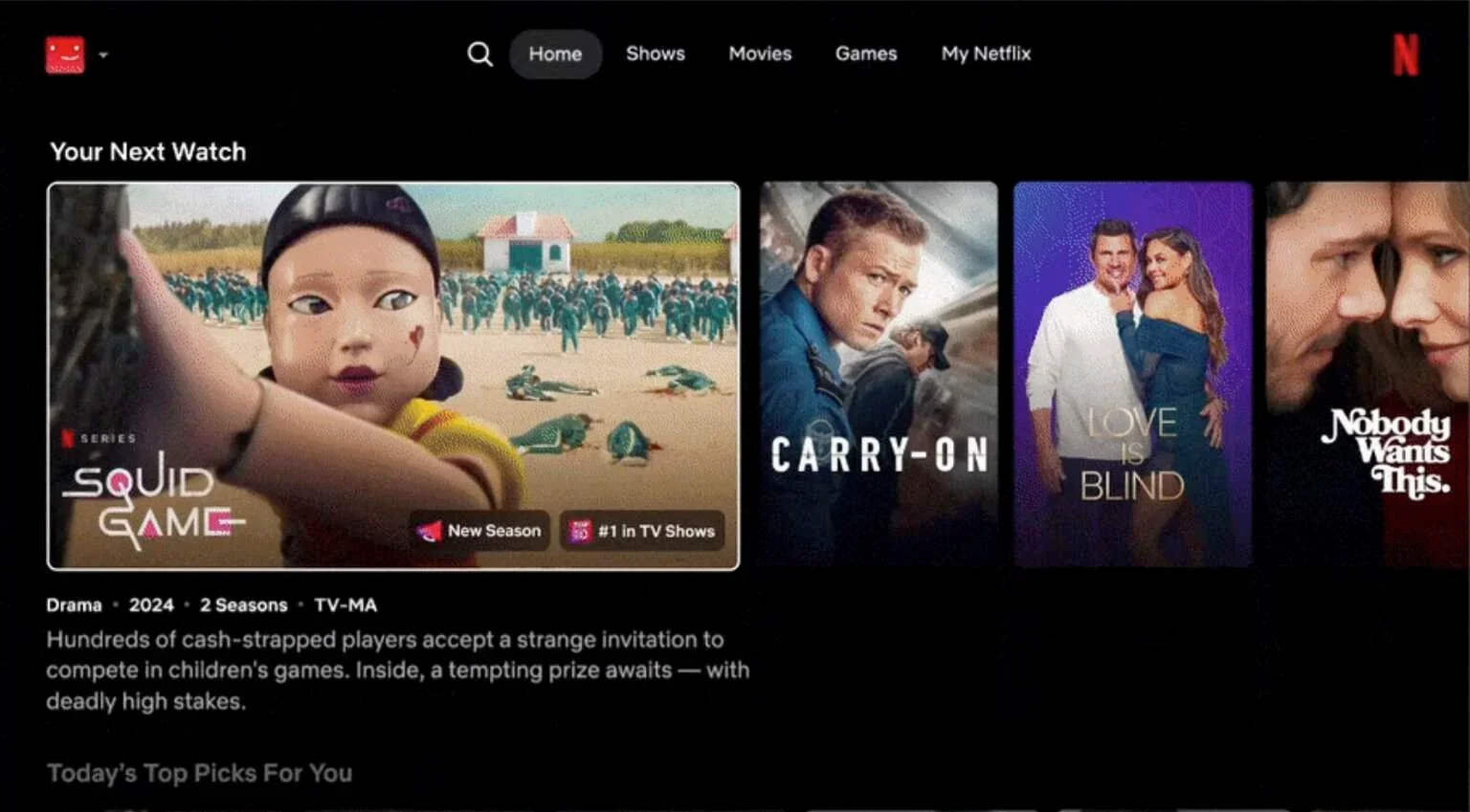
Netflix is not afraid of taking big gambles. Whether that is as far back as moving from mailing DVDs to launching a streaming platform, or as recently as embarrassing live sports rights. However, the streaming giant’s latest move is proving to be controversial. The streamer is in the midst of rolling out big changes to its user experience, and if you haven’t gotten it yet, you will in the near future. UI changes can have a big effect on engagement, but so far, customers are signaling their disapproval for the makeover.
Key Details:
- Unhappy customers: Viewers are expressing their displeasure with the new Netflix layout.
- Is bigger better?: Netflix’s new experience expands TV and movie thumbnails to show more information.
- Get engaged: Beta tests did not definitively prove that engagement was improved by the overhaul.
The new Netflix user interface is not at all popular with fans who have seen it hit their TV screens. Owners of LG and Samsung TVs have gotten the update first, but it is continuing to launch on more and more screens every day. The Hollywood Reporter cites users on Reddit and YouTube who aren’t thrilled with the so-called upgrade.
“I have been saying for YEARS that Netflix has the best layout of any streaming service and have been annoyed that other streaming services have an inferior layout,” one Redditor said. “Now, Netflix seems to be copying other services rather than the other way around. Why? Does anyone here actually like seeing fewer options on the screen? … You have to scroll endlessly to make it through what used to be a single screen’s worth of content info. I hate this.”
The new Netflix layout moves the menu on the left side of the screen to the top and simplifies it, putting show tiles front and center. These tiles have been expanded to show fewer options on the screen at a time, and they grow even larger when you highlight them, showing more details about the title in question.
There are plenty of other features to explore in the new Netflix interface, such as an AI-assisted search function that will theoretically help viewers pinpoint what they want to watch. The company tested its new experience thoroughly over the course of a year, but it did not prove with certainty to be an improvement in terms of generating engagement, although Netflix did say that a majority of test users preferred the new UI over the old one.
It is understandable that users are frustrated by the change to the user experience. Familiarity allows for an ease of use that makes the entire product more enjoyable to use. However, now that Netflix has changed how its menus work, viewers are having to re-learn the process to discover, search for, and watch the things that they come to the platform for. The streamer is undoubtedly hoping that as subscribers become more accustomed to the layout that they will take to it as well as the previous version.
Do you have the new Netflix user interface yet? If so, give us your opinion about the changes in the comments — we want to hear if you concur with those who don’t like the layout, or if you think it’s an improvement over what came before.

Netflix
Netflix is a leading subscription-based video streaming service that offers on-demand access to an extensive library of over 3,000 movies, 2,000+ TV shows, and a growing collection of acclaimed Netflix originals. Renowned for producing groundbreaking content, Netflix has become a cultural powerhouse with hit originals like “Stranger Things,” “Wednesday,” “Squid Game,” “The Crown,” “Tiger King,” “Bridgerton,” “The Witcher,” and “Black Mirror.”