Hulu Updated Its User Interface, but Must Do More to Make Content Discovery Easier

On Thursday, as TV viewers began logging into Hulu to catch up on their favorite ABC or FOX shows from the day before, or to check out the latest original series from the Disney-owned streamer, they were greeted by a message informing them that the platform’s user interface would be going through a redesign in the coming weeks.
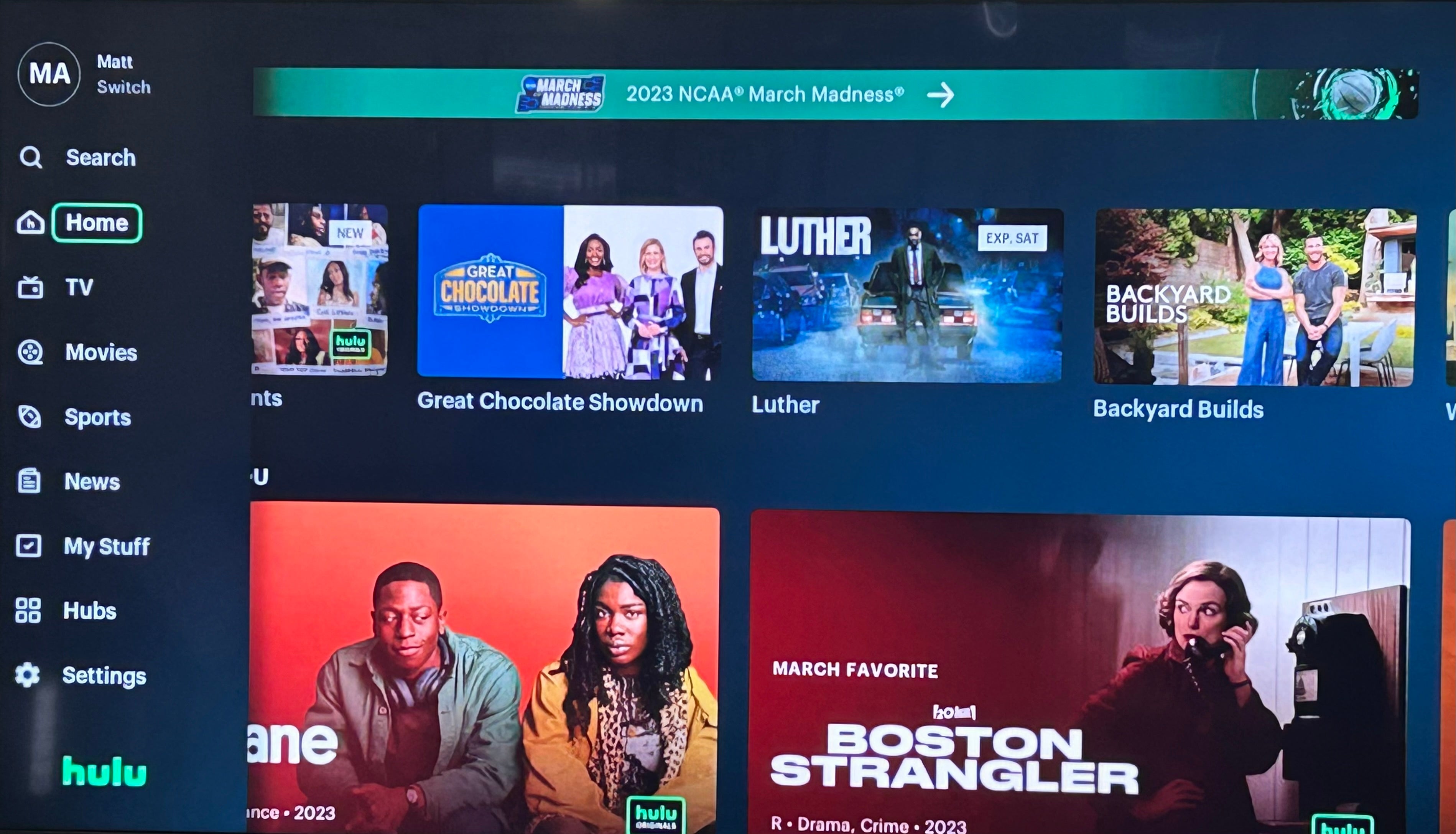
The change noted in the message was that the navigation menu would move from the top of the screen to the left-hand side on connected and smart TVs, mimicking a change that many other streamers have made, including Netflix, which made a similar switch last November.

As of now, the change does not appear planned for the web or mobile versions of the streamer, both of which still utilize a menu at the top of the screen for Search, Hubs, TV, Movies, Sports, and News. Of course, Hulu’s corporate sibling streamer Disney+ also has a left-side navigation menu, but I would not take this to be any indication that CEO Bob Iger is hastening the integration of the services into a single platform.
However, the change — which has already gone into effect for some Hulu users — seems to be designed to keep in step with the way that users are interacting with most other streaming platforms, and to make it easier to find the content that viewers are searching for. Now, rather than having to scroll all the way up to the top of the page, users can simply use their remote’s back button to expand the menu.
In addition to the Search function, from the menu users can also go directly to their Hulu homepage; the TV, Movies, Sports, and News destinations; the page for their My Stuff selections; as well as a Hubs landing page that includes all of the different studios and channels housed on the Hulu platform, including Hulu Originals, Hotstar on Hulu, Twentieth Century Studios, FX on Hulu, ESPN+, ABC, and more.
This is also where users find collections elevating underrepresented voices, as well as Audio Descriptions of popular titles, and more. This new lefthand-side menu is also the way that customers can switch between profiles and access their settings.

While the convenience of moving the menu to the left side and allowing viewers to access it with one click of a button is appreciated, there is a lot more that Hulu engineers can do to make the interface more user-friendly. Content discovery is one of the most crucial ways that streamers can keep customers engaged with their services, beyond whatever title brought them to the platform in the first place. If a viewer subscribes to a streaming service for a specific show, once that season has wrapped up, making it easy for them to find something else that interests them is important to make sure that they don’t unsubscribe.
Numerous studies have indicated that how services lay out their content inside their apps is vital to making sure that viewers find what it is they are looking for, whether that is seeking out a specific series or stumbling across something that speaks to them.
Currently, Hulu is one of the most cluttered, sloppily arranged services on the market. While Prime Video is the unquestioned leader in both the confusing and difficult-to-navigate categories, Hulu isn’t much better. The service’s page is incredibly messy in ways that don’t always make sense, and often make it difficult to find what it is you are looking for.
Unlike most streamers that rotate multiple high-profile recent releases in a carousel, Hulu only puts one title at the top of the page on each page load, and it is often an obscure series or film that — at least in my case — seemingly has little connection to my interests. But, beyond that, the entire organization of the Hulu app makes little sense when you understand why Hulu has grown to have over 48 million subscribers.
While Disney’s general entertainment streamer has done an admirable job in creating compelling originals, the true draw of the service is in being able to watch shows from across the ABC and FOX networks the day after they air on their linear channels. This means that more often than not, viewers will be coming back regularly to catch the latest episodes upon their release. However, to get to the shows that you watch regularly, you have to scroll down beyond the unrelated show that you’ve never watched in the hero position, past the random news or sports programming happening live, and past separate rows of recommendations for both shows and movies that you’ve never watched, just to find your “Continue Watching” list.
Now, I understand that Hulu is trying to encourage you to engage with other compelling content on its service in an effort to keep you subscribed, but forcing users to jump through unnecessary hoops in order to do the thing that they specifically come to your service to do seems counterproductive. This is exacerbated by the fact that seemingly useful the “Because You Watched (Fill In the Blank)” row of recommendations doesn’t happen until after the “Continue Watching” row.
If Hulu wants to make sure that my experience is a positive one, it would introduce me to more of its buzziest titles at the top of its page, and right below that, it would have the list of shows that I routinely watch on the platform, organized by which ones have the most recently released unwatched episodes.
Then, below that — in a way that was still visible and obvious — Hulu would start making specific recommendations based on individual shows that I watch. Under the streamer’s current organization, the recommended shows and movies seem to be pulling from all of the titles viewed (whether once or dozens of times), which can actually make things more difficult when trying to pick something new to watch.
First off, while Hulu does allow individual profiles in order for different users to keep their streaming preferences separate, not everyone utilizes that option, meaning that the recommendations on a parent’s profile might be based on what they watch, what their partner watches, what their teenage daughter watches, and what their seven-year-old son watches. This essentially renders the recommendations meaningless when all grouped together. But it can still be a problem if only one person watches on the profile, but has a wide range of interests or experiments with a show and then decides that they don’t like it.
So, if Hulu were to prioritize recommendations based on specific titles, that would make picking content much more straightforward. For example, “Because You Watched The Masked Singer” with options for “American Idol,” “Celebrity Name That Tune,” and “So You Think You Can Dance” is a lot more helpful when you are in the mood for some silly, low-stakes reality show, than a prominently featured “TV for You” row that includes new episodes of ABC detective show “Will Trent,” Canadian comedy “Schitt’s Creek,” “Adventure Time” from the Cartoon Network, or Freeform’s “Single Drunk Female.”
The fact that Hulu has a seemingly endless scroll of random, disorganized recommendations can feel overwhelming; with vaguely named “Trending,” “Newly Added TV,” and “Binge-Worthy TV” rows stacked on top of each other above the more specific “Sitcoms,” “Competition Reality,” and “Family TV” options, it can be frustrating to have to wade through so many ill-defined categories to even find the genre that you are interested in.
So, since Hulu’s engineers are obviously working on making the service easier to navigate, now would be a great time to reassess how it is that users are able to watch the things that they come to Hulu to watch and to discover new titles from the service’s vast, ever-increasing library of offerings. I know that there are tons of shows — new and old — on Hulu that I would love to check out, but the platform makes it so difficult to find what I already know that I want, the prospect of diving in to find out what’s just generally feels like it’s not worth the effort.
Hulu
Hulu is a video streaming service that gives access to thousands of full seasons of exclusive series, hit movies, kids shows, and Hulu Originals like “Only Murders in the Building,” and “The Handmaid’s Tale.”